I was having several conversations at re:publica on wiki adoption (and consulting) topics. Over time, we (that is Andreas Gohr, Christian Kreutz, Tim Bartel, me and sometimes innocent bystanders and fellow twitterati) covered wiki technology, design and a wide array of social software adoption issues. One of the central topics was the question of WYSIWYG editors and their relevance for wiki adoption.
This was triggered by this blog post of Tim Wang (which I found via Tim Schlotfeld), that referred to a short wiki comparison, culminating in this:
Regardless, lack of a WYSIWYG editor continues to scare off most users and therefore wikis lacking one should be eliminated from contention.
This unsettled me, and while I am hearing this argument again and again, I think that this line of reasoning misses some important points. It’s not only about leaving out many able and well-kept wiki engines by restricting evaluation to those with a WYSIWYG editor, and it’s not only about an obvious lack of real research with real users (sure, wiki syntax scares off people and Wikipedia is a miserable failure) – it’s about a fundamental misunderstanding of both efficient knowledge work and user interfaces. While WYSIWYG is supposed to offer clarity, simplicity and easy adoption I hold that this is exactly what wiki markup is good for.
– Wiki markup editing and its restricted user interface makes it easier to focus on content, much like the “dark mode” some people choose for real editing – basically because WYSIWYG editors distract attention.
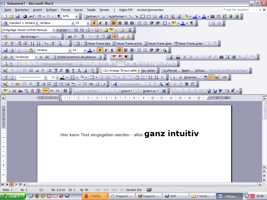
– We want employees to focus on content, edit it quickly and use the wiki (and the intranet) in an efficient way – we don’t want our employees to fiddle with nice looking but irrelevant eye candy or with overblown full-featured editors like this:

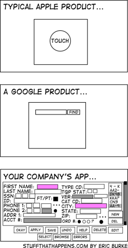
– Antoine de Saint-Exupery, author of The Little Prince, once said, “Perfection is finally attained not when there is no longer anything to add but when there is no longer anything to take away.” Simplicity doesn’t equal low functionality, and is more important than comprehensiveness (and complexity). Smart web applications need to employ intuitive ways of interaction. Just look at these different user interfaces (by Eric Burke), showcasing common but different approaches to user interface design:

– People with relevant knowledge in the organization (yes, we’re talking about the “empty quarter“, often these are people close to retiring) need simple and clean user interfaces. User interface design ideas like usability, simplicity and clarity suit these people.
– WYSIWYG editors aren’t perfect yet – if you’re just trying to format text you’ll be OK, but for more advanced stuff like tables etc. you need wiki markup editing anyway. Going the WYSIWYG way is risky too – think of initial user acceptance, that will suffer when people get disappointed by their efforts at wiki editing. Yes, even when it looks like MS Word it ain’t the same, and becoming frustrated because the wiki obviously scrambles the nice looking word document you just copy-pasted makes for a really bad start. Granted, you can coach and explain this to your users, but then – why not teach them simple markup rules in the first place. Combine this with an explanation why dragging a picture into Word works but won’t (for now) work with a web-based application.
– Advanced users are going to use wiki markup language anyway, beginning wiki users may start with WYSIWYG but will learn soon that the other way is more efficient. When they have grasped a few simple techniques, such as putting ** around a text to make it bold or putting [[ ]] around text to create links, they can create great looking content with minimal fuss, and the look and feel of the wiki pages is consistent throughout the wiki. Providing the choice between both ways, allowing for quick changes between both modes of editing, is one solution. And yes, it’s no big wonder that both Confluence and Socialtext are offering both alternatives in parallel, simple and advanced (yes, that one’s wiki markup mode). Try both modes at the Socialtext WikiWednesdayStuttgart page. So the argument that adoption hinges on the existence of a WYSIWYG editor is flawed – wiki markup can be easily explained and adding some coaching efforts to an implementation project doesn’t hurt, explaining the rationale behind wiki usage etc. I have had decent successes with 15 minute short introductions, followed by “train the (peer) trainer” coachings, after all editing wiki markup editing is neither programming nor rocket science.
– What wiki users really need are standardized wiki markups (like wikicreole). This would make it both easier to export/import content between different wiki engines (and document processors like Word), and to write powerful and easy-to-use WYSIWYG editors. Until then we need to rethink some of our assumptions – especially about what end-users want and need. I see that people want to do their job easily and efficiently and that user interface information overload is a problem. So wiki markup is a solution, not a problem.


