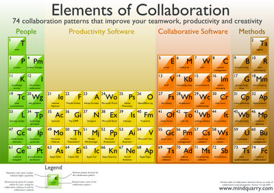
Mindquarry have devised a nice visualization, aka the “Periodic Table of Collaboration” differentiating four categories: People (Roles), Productivity Software, Collaborative Software and Methods.
The aim of “Elements of Collaboration” is to give an overview about current collaboration techniques and technology and to show how better collaboration can lead to improved workflows and higher productivity.
This aim is ambitious – while providing an overview is cool and I really like this approach it surely does not show how workflows can be improved or how productivity may benefit – besides, any concept that presents IE and Outlook under the hood of productivity software is seriously flawed in my mind …
Joking aside, there are a lot of clever ideas and concepts collected and refined, it may serve very well as starting point for (collaboration-oriented) discussion, more than e.g. the other enterprise 2.0 visualizations I’ve pointed out here, summing up then:
This framework provides a concise view of the nature of Web 2.0. While one can debate whether all important issues are collected, this visual approach lends itself to kicking off discussions (where one can elaborate further on). It provides a nice starting and reference point, and this is essential: When advising on the ideas and concepts of Enterprise 2.0 in the corporate world, I’m experiencing that it’s best to explain both instruments (methods and tools, i.e. the “how”) and goals and visions (paradigms and principles, the “why”) intertwined …


