I was having several conversations at re:publica on wiki adoption (and consulting) topics. Over time, we (that is Andreas Gohr, Christian Kreutz, Tim Bartel, me and sometimes innocent bystanders and fellow twitterati) covered wiki technology, design and a wide array of social software adoption issues. One of the central topics was the question of WYSIWYG editors and their relevance for wiki adoption.
This was triggered by this blog post of Tim Wang (which I found via Tim Schlotfeld), that referred to a short wiki comparison, culminating in this:
Regardless, lack of a WYSIWYG editor continues to scare off most users and therefore wikis lacking one should be eliminated from contention.
This unsettled me, and while I am hearing this argument again and again, I think that this line of reasoning misses some important points. It’s not only about leaving out many able and well-kept wiki engines by restricting evaluation to those with a WYSIWYG editor, and it’s not only about an obvious lack of real research with real users (sure, wiki syntax scares off people and Wikipedia is a miserable failure) – it’s about a fundamental misunderstanding of both efficient knowledge work and user interfaces. While WYSIWYG is supposed to offer clarity, simplicity and easy adoption I hold that this is exactly what wiki markup is good for.
– Wiki markup editing and its restricted user interface makes it easier to focus on content, much like the “dark mode” some people choose for real editing – basically because WYSIWYG editors distract attention.
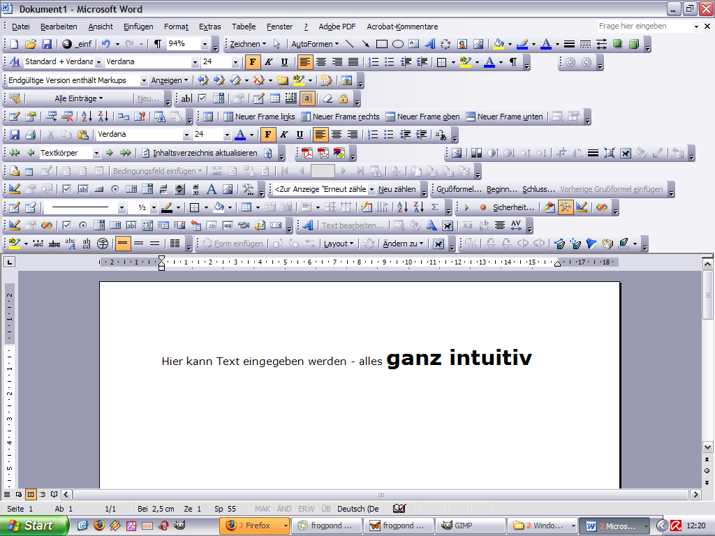
– We want employees to focus on content, edit it quickly and use the wiki (and the intranet) in an efficient way – we don’t want our employees to fiddle with nice looking but irrelevant eye candy or with overblown full-featured editors like this:

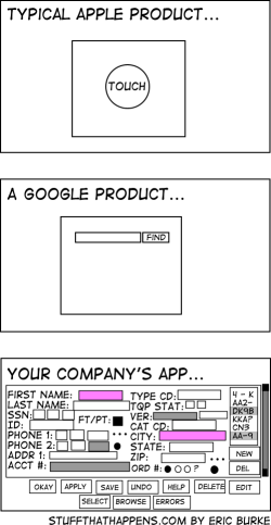
– Antoine de Saint-Exupery, author of The Little Prince, once said, “Perfection is finally attained not when there is no longer anything to add but when there is no longer anything to take away.” Simplicity doesn’t equal low functionality, and is more important than comprehensiveness (and complexity). Smart web applications need to employ intuitive ways of interaction. Just look at these different user interfaces (by Eric Burke), showcasing common but different approaches to user interface design:

– People with relevant knowledge in the organization (yes, we’re talking about the “empty quarter“, often these are people close to retiring) need simple and clean user interfaces. User interface design ideas like usability, simplicity and clarity suit these people.
– WYSIWYG editors aren’t perfect yet – if you’re just trying to format text you’ll be OK, but for more advanced stuff like tables etc. you need wiki markup editing anyway. Going the WYSIWYG way is risky too – think of initial user acceptance, that will suffer when people get disappointed by their efforts at wiki editing. Yes, even when it looks like MS Word it ain’t the same, and becoming frustrated because the wiki obviously scrambles the nice looking word document you just copy-pasted makes for a really bad start. Granted, you can coach and explain this to your users, but then – why not teach them simple markup rules in the first place. Combine this with an explanation why dragging a picture into Word works but won’t (for now) work with a web-based application.
– Advanced users are going to use wiki markup language anyway, beginning wiki users may start with WYSIWYG but will learn soon that the other way is more efficient. When they have grasped a few simple techniques, such as putting ** around a text to make it bold or putting [[ ]] around text to create links, they can create great looking content with minimal fuss, and the look and feel of the wiki pages is consistent throughout the wiki. Providing the choice between both ways, allowing for quick changes between both modes of editing, is one solution. And yes, it’s no big wonder that both Confluence and Socialtext are offering both alternatives in parallel, simple and advanced (yes, that one’s wiki markup mode). Try both modes at the Socialtext WikiWednesdayStuttgart page. So the argument that adoption hinges on the existence of a WYSIWYG editor is flawed – wiki markup can be easily explained and adding some coaching efforts to an implementation project doesn’t hurt, explaining the rationale behind wiki usage etc. I have had decent successes with 15 minute short introductions, followed by “train the (peer) trainer” coachings, after all editing wiki markup editing is neither programming nor rocket science.
– What wiki users really need are standardized wiki markups (like wikicreole). This would make it both easier to export/import content between different wiki engines (and document processors like Word), and to write powerful and easy-to-use WYSIWYG editors. Until then we need to rethink some of our assumptions – especially about what end-users want and need. I see that people want to do their job easily and efficiently and that user interface information overload is a problem. So wiki markup is a solution, not a problem.
Sorry, but I don’t fully agree with you.
I am currently on the lookout for a wiki (and possibly blogging platform) solution to use internally at the company I work for, and I can tell you that I already have a hard time to bring people to realize and accept that a wiki is not some sort of geeky and complicated thing. If the wikis I’m showing them were to have wiki mark up only, they’d run away calling me a fool.
This being said, I do agree with you on the fact that the WYSIWYG interface has to be really simple, in order to avoid what you quite well described; people spending more time on layout than on content …
For a initial testing project I selected DokuWiki despite it has no WYSIWIG editor (at least for Windows Server, there is one for Unix AFAIK). Yes, one (main) reason was that I know it quite well. But I think too, simplicity is king – for the content as well as for the Wiki 🙂
On the other hand I know that people expect a “Word editor”.
My colleaques are 30 – 40 yrs old and open minded. I’m curious how this little project will do…
Xavier, I fully understand your doubts and I know this sitation as well.
Let me add 2 cents of advice:
– show don’t tell – show them how easy one can edit and contribute to wiki pages
– show them that even with a WYSIWYG editor there’s no way to just copy-paste documents from Word files (and that these are completely different approaches, documents ain’t wiki pages and vice versa)
– ask hard questions – is this reluctance towards wiki markup based upon a mere sentiment, some kind of research or is it only a polite way of saying “we don’t want this, now go away”
I agree that this seems to be a hard sell, but I have seen people and companies who are using different wikis – without html editor – really successfully. And we consultants, whether we’re working internally or are called in to help with some issues, need to ask these hard questions – all to help companies get the most out of wikis and other social software.
Frank, all the best with this little project. I trust you to explain and convince this to your colleagues, after all you’re well positioned and experienced.
This makes for another 2 cents:
– recruit people (wiki promoters) that explain, coach and “walk the talk” – preferably senior people
Basically, this leads me back to another thought me and Andreas were developing at re:publica: Stewart Mader includes WYSIWYG as an adoption pattern (http://tinyurl.com/6dgfvf) but in fact we may also see this as an anti-adoption pattern, with the basic fix being the offering of both ways.
@Martin: yes, good advices.
This being said, I haven’t had any reluctance towards wiki markup since I haven’t shown any.
And this for a simple and stupid reason; I don’t know it myself! ;o)
I’m a (geeky) Marketing guy, not an IT one … ;o)
By the way, do you know XWiki? If yes, may I ask what you think about it?
[…] Martin Koser (frogpond) greift das Thema WYSIWYG-Editoren in Wikis auf und plädiert für die reine Lehre: Editoren sind nicht wirklich erforderlich, die User von Wikis in Unternehmen sollen sich auf das Wesentliche konzentrieren (”Content”). […]
@Xavier I don’t know XWiki that good, but what I’ve seen at demonstrations has impressed me.
Oh, and in relation to wiki markup: I am not a geeky IT guy either, but perhaps I have the (dis-)advantage of long-time acquaintance with plain text editors in wikis – starting with wikis in 2001 I had no choice
[…] in this. Aside from having one of the funniest graphics I’ve seen in a long time (above), Martin Koser has a good post today in which he debates the merits of wiki markup language and why WYSIWYG shouldn’t be a barrier […]
@Martin: hehehe, the last paragraph of your last comment reflects exactly what I wrote this morning on Scott Schnaars’ blog! ;o)
[…] So here it is a list of arguments against WYSIWYG editors. Martin Koser also wrote another excellent post about it. […]
Einfachheit in der Nutzung – Oberflächengestaltung…
Der siebte Wikimanagement-Erfolgsfaktor lautet "Einfachheit in der Nutzung".Manchmal sagt ein Bild ja mehr als tausend Worte:Die Graphik stammt übrigens von Erik Burke. Erstmals gesehen habe ich die Graphik übrigens bei frogpond.de…
My main complaint with most markup-based wikis is the excruciating edit/save cycle. You go and tweak the markup syntax just the way you like, you hit save (or if you’re lucky, preview) to view the result. You find a typo or another change to make, which means you have to hit edit, scroll back down to where you were, and start the process all over again.
WYSIWYG editors, for all their faults, have the ability to do away with this cumbersome edit/save cycle completely. You just edit your page directly (ideally with some good key combinations in order to approach the speech with which you can enter formatted text with traditional markup).
So I actually tried to tackle the problem of making a decent, simple, fast WYSIWYG wiki editor. The result is called Luminotes, and you can check it out at http://luminotes.com/
Let me know what you think.
@Dan I don’t know – honestly, editing and hitting save didn’t disturb me in the past – like you said there’s always the preview available (and the “only small change” checkbox).
And while I like the experience of editing in Luminotes, there are also some things missing that come with the standard edit-save cycle like comparing versions (diffs) of pages – but, well, perhaps I didn’t find it?
In my experience most people argue against wiki markup from the experience of a try at editing a Wikipedia article – and Mediawiki markup is seriously limited (to say it very friendly). This problem of “oh no, it’s code” needs to be tackled with easy and powerful WYSIWYG editors in time, Luminote sure is an interesting thing to watch.
[…] at the center of interest, I particularly like the focus on integration and usability (yes, this is important): Ease-of-use can be a dig differentiator in this market of “enterprise collaboration […]
[…] parallel anbieten. Eine ausführlichere Analyse von Pro und Contra findet sich hier (”Simplicity, adoption and WYSIWYG […]